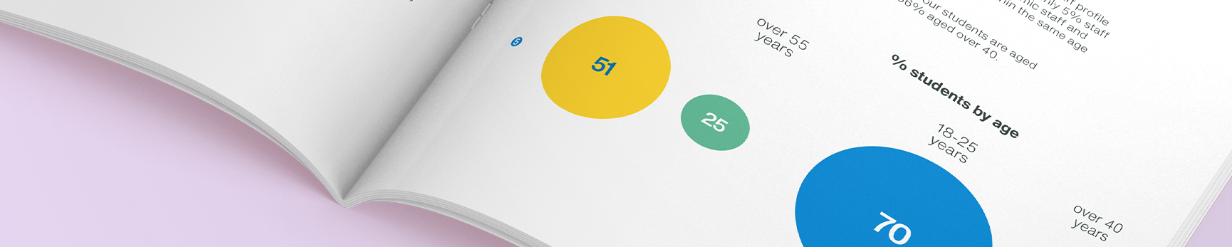
Data visualisation
We generate a lot of data. From collating insight, to measuring outcomes, data is key to understanding how the University is working and how we plan for the future.
Our data visualisations should be clear, persuasive and beautiful. They should simplify complex information, help us tell stories and allow the reader to quickly spot comparisons and trends.
Before you start
Before jumping headfirst into visualising your data, consider the following:
- What point are you trying to make? Is everything in your data essential to telling that story? Ditching some of that hard gathered data might be painful, but if it’s confusing your point, it’s time to let go.
- Is your data clean? Is your spreadsheet formatted and labelled properly? Clean data is far easier to display and analyse.
- Keep it simple. Charts and graphs help turn complex ideas into easy to understand visual concepts. Avoid clutter and make data the hero.
- Pick the right chart type. Choosing the right format is fundamental to effectively presenting your data. The guidance below can help with this.
- Emphasise important data. Where possible, use colour and tone to help make the important parts of your story stand out.
- Can you describe everything in the chart in one or two short sentences? If not, it’s probably bloated and may require simplifying.
Basic formatting

Axes should be set a 0.5pt in Dark Grey
Grid lines should be set at 0.5pt in 50% Dark Grey
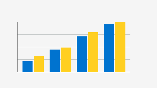
Plotted data could be coloured according to series, and should be spaced clearly from other series or categories. Guidance on use of colour can be found further down this page
Values and labels should be set in Helvetica Now Text Light, Dark Grey, at the same point size as surrounding body copy (no smaller than 9pt)
Key/legends should be set in Helvetica Now Text Light, Dark Grey, at the same point size as surrounding body copy (no smaller than 9pt), supported by square colour indicator slightly larger than the cap height
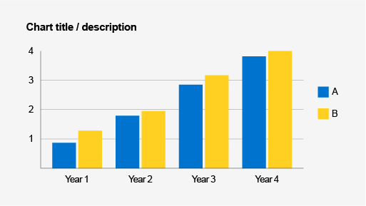
Chart titles should be set in Helvetica Now Text Bold, Dark Grey, slightly larger than values and labels
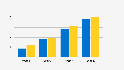
Use of colour
Colour is an essential tool in ensuring easy and correct interpretation of data; too little or too much can impact the reader’s ability to process the information. You should always consider the wider context of the document in which the data appears when selecting colour combinations. The below guidance provides an overview of best practice in the context of a bar chart.
When data is from one category, or series are clearly labelled, use one colour
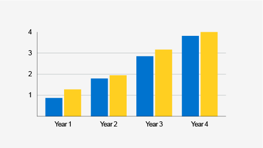
When displaying data from two series, use two contrasting colours
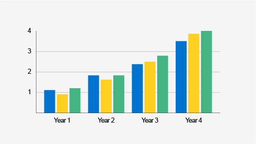
When displaying data from three series, use three complementary colours of a similar tone
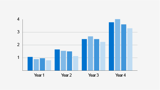
When displaying data from four or more series, use a range of tones from one or two complementary colours
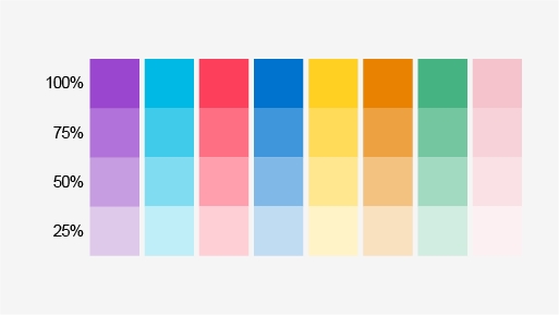
Colour should be taken from the University's secondary palette. Tonal values are available at 100%, 75%, 50% and 25%.
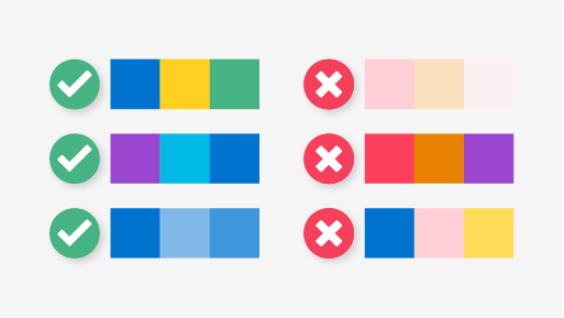
Care should be taken when pairing colour:
- Do not pair colours that are too similar in tone
- Do not pair colours that clash
- Do not use different tonal values of different colours unless absoltely nessesary, in which case adjacent colours should have sufficient contrast.
Colour themes in Tableau
- Go to the My Tableau Repository folder in your Documents directory, and open the Preferences.tps file. Right click on the file and open with ‘Notepad’.
- Between the opening and closing <workbook> tags, insert opening and closing <preferences> tags so that the final output looks like this:
<?xml version='1.0'?>
<workbook>
<preferences>
</preferences>
</workbook> - In the Preferences.tps file, between the "preferences" tags, paste the following. Be sure to use straight quotation marks, not curly quotation marks, to delimit the palette's name and type.
<?xml version='1.0'?>
<workbook>
<preferences>
<color-palette name="Herts Categorical palette" type="regular">
<color>#9A46CF</color>
<color>#000000</color>
<color>#FFFFFF</color>
<color>#00B9E4</color>
<color>#F53F5B</color>
<color>#FFCF21</color>
<color>#45B382</color>
<color>#E88200</color>
<color>#F4C3CB</color>
<color>#0073CF</color>
</color-palette>
<color-palette name="Herts Purple-Orange Sequential Palette" type="ordered-sequential">
<color>#9A46CF</color>
<color>#cacaca</color>
<color>#E88200</color>
</color-palette>
<color-palette name="Herts Red-Green Sequential Palette" type="ordered-sequential">
<color>#F53F5B</color>
<color>#cacaca</color>
<color>#45B382</color>
</color-palette>
</preferences>
</workbook> - This should create 3 palettes, ‘Herts Categorical Palette’ that has all of the Herts colours within the brand toolkit, and two examples of sequential palettes created using the Herts colours. For help to create your own sequential palettes refer to Tableau's help pages.
- Save the Preferences.tps file and then restart Tableau Desktop.
- Open a data source, From the Data pane, drag a dimension, to Colour.
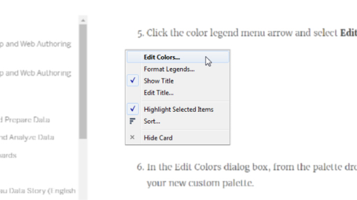
- Click the colour legend menu arrow and select Edit Colours.
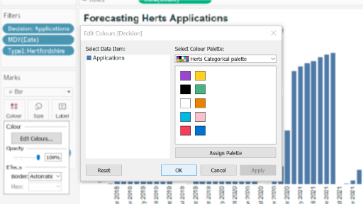
- In the Edit Colours dialog box, from the palette drop-down list, select one of the custom Herts palettes.
Step 7: Click the colour legend menu arrow and select Edit Colours.
Step 8: The Edit Colours dialog box
- Click the Assign Palette button to assign the custom colours to each respective field.
- Click OK.
Types of charts
Use the examples below to decide which format works best for your specific data set.
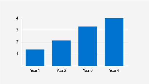
Column chart – used for categorical data
Bar chart – used for categorical data, handy when labels run over two lines
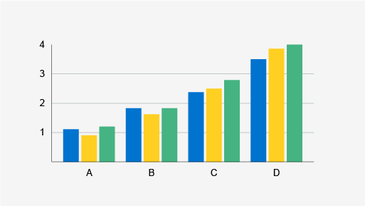
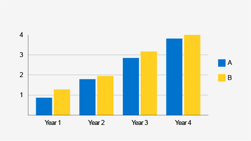
Grouped column chart – for when categorical data contains more than one set
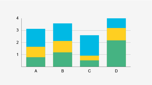
Stacked column chart – used to show how the larger category is divided into the smaller categories
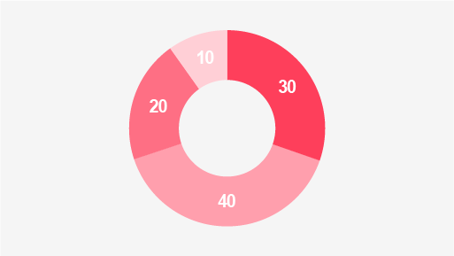
Doughnut chart – used to illustrate numerical proportion, should contain no more than four values
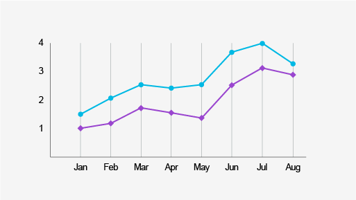
Line graph – commonly used to display trend over time
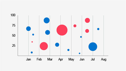
Bubble chart – displays three dimensions of data: X, Y and size
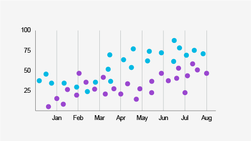
Scatter plot – used to display correlation and distribution, great for illustrating patterns
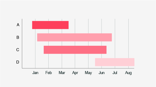
Gantt chart – used to display categorised stand and end points on a timeline
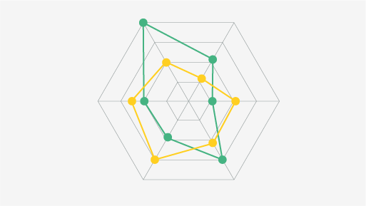
Radar diagram – used to display mulitvariant data for one or more categories, the value increases with the radius
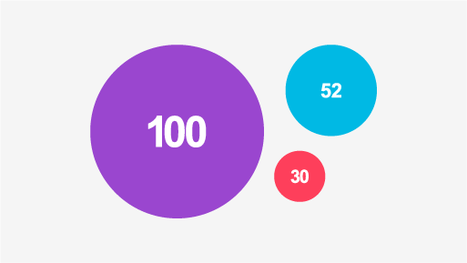
Proportional area chart – used to display the relative size of data without the use of scales
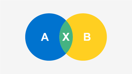
Venn diagram – used to display all possible relationships between a small number of sets
Pictorial percentage chart – used to illustrate part to whole within related iconography
Pictorial fraction chart – used to illustrate part to whole as a series of related iconography
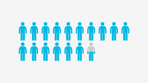
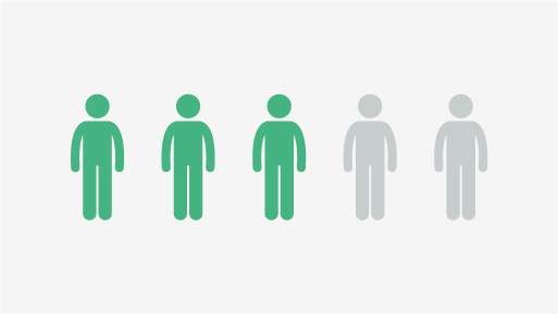
Pictorial unit chart – uses a number of icons to display scale, usually for comparison
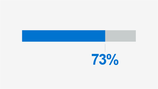
Progress bar – displays part to whole in the context of progression or achievement
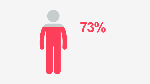
Icon + text – used to illustrate a single value with related iconography

Number + text – used to give further context to numerical figures
Related Guidance
Get in touch
If you have any questions please contact a member of the team:
| Contact | |
|---|---|
| Studio team, Marketing and Communications | studio@herts.ac.uk |
| Jak Kimsey, Head of Digital and Creative Experience (he/him) | j.kimsey1@herts.ac.uk |
| Marketing and Communications Business Support | marketinguh@herts.ac.uk |