Introducing our visual identity
First impressions count and in a competitive market, it’s important that we show our audiences who we are and what we stand for. How we represent our organisation visually – our visual identity – is a key element in how we do this.
What is a visual identity?
A visual identity, at its core, is a collection of logos, colours, typefaces and graphic elements that are drawn together to convey a brand proposition, or story. You might hear this called branding, referring to the visual application of identifying brand features.
Each component is carefully constructed to work in harmony with the others, and when these come together, the brand’s story becomes tangible, unambiguous and relatable. A strong visual identity should tell the brand story in a way that is targeted to its audience and continues to resonate throughout the customers’ relationship (or ‘journey’) with the brand.
Why does it matter?
Having a strong and uniform visual identity is crucial to building audience trust and communicating shared values and aspirations. Paired with a visual style that is attractive to the audience and cuts through the market, this fosters trust, engagement and importantly, action.
Ensuring both the brand personality and visual identity is extended across all brand channels, whether centrally or locally managed, is critical, as any deviation from an established direction may cause confusion and ultimately mistrust.
How ours has evolved
At Herts, our mission is simple: to Transform Lives. But as such a diverse organisation, the way in which we do this differs from audience to audience and our subject matter covers a wide spectrum. Our visual identity therefore plays a key role in joining up our varied activities, ensuring whatever we do, it feels like Herts.
Our updated visual identity has been carefully constructed to ensure we are able to speak to our many audiences in a tone and style that truly feels like Herts. This is because, at every stage, our brand personality and tonal principles have guided our decisions, and the result is the embodiment of our unique personality: approachable, supportive, ambitious, open-minded and entrepreneurial.
We've made the following key changes:
Then: Using full bleed images as a base for publications caused issues with the clarity and legibility of headlines.
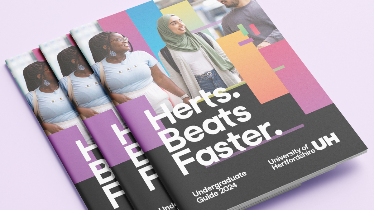
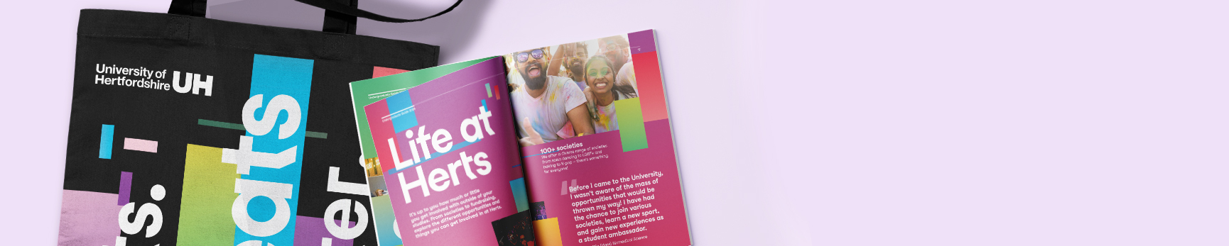
Now: We have introduced a limited palette of base colours and a striking new graphic device called the ‘Rhythm’ which allows us flexibility with image and text layout.
Then: The use of headline typeface fell short in terms of creating a distinct impact across our marketing materials.
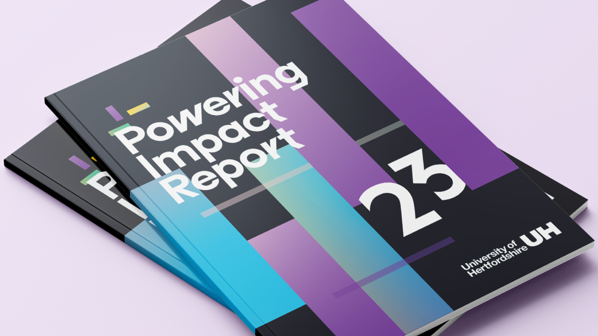
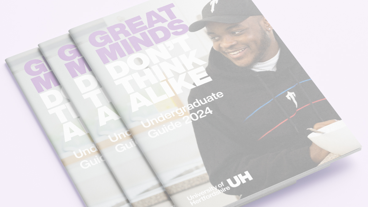
Now: We've introduced a new customisable headline typeface to better communicate our unique proposition and stand out in a crowded market.
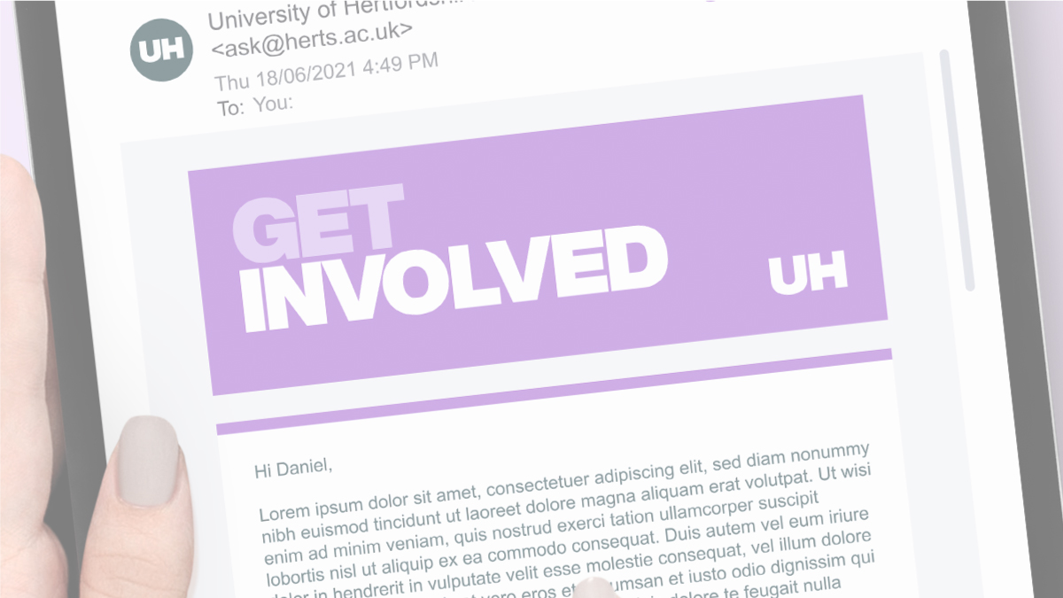
Then: Incorporating both images and text into our email banners often constrained the available space, occasionally leading to a cluttered appearance.
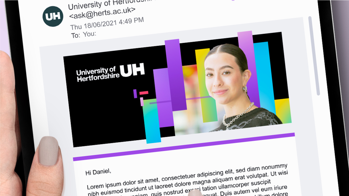
Now: Taking an image led approach paired with the ‘Rhythm’ now results in something that feels more inspiring to our audiences.
Dive deeper
Get in touch
If you have any questions please contact a member of the team:
| Contact | |
|---|---|
| Studio team, Marketing and Communications | studio@herts.ac.uk |
| Jak Kimsey, Head of Digital and Creative Experience (he/him) | j.kimsey1@herts.ac.uk |
| Marketing and Communications Business Support | marketinguh@herts.ac.uk |